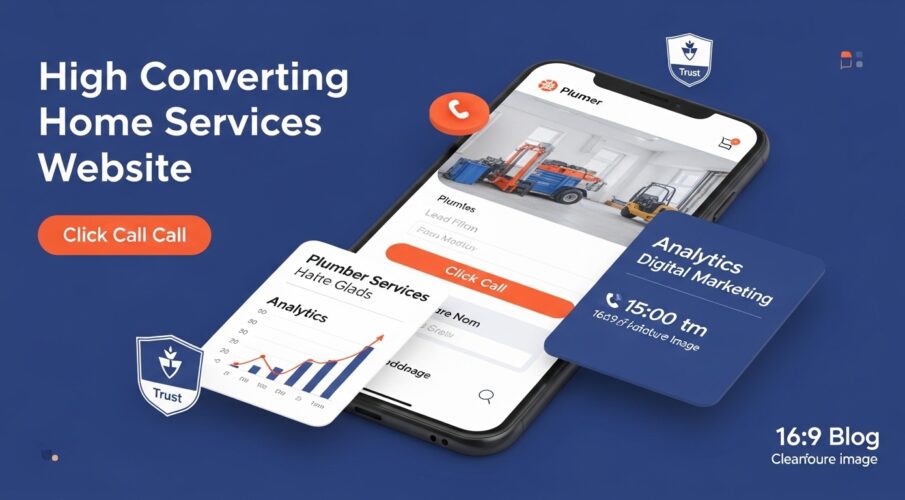
High Converting Home Services Website | The Complete Build Guide
Most home services websites have the same problem: they look fine and do almost nothing.
A plumber, HVAC company, or roofing contractor can spend thousands on a website that loads in the right colors, has a professional logo, and lists every service they offer — and still generate three leads a month. Meanwhile, a competitor with a simpler site is booking jobs every day.
The difference isn’t design taste. It’s conversion architecture. A high converting home services website is built around one goal: turning someone who found you online into a call, a booked appointment, or a submitted form — fast. Every element on the page either contributes to that or gets in the way.
This guide covers what those elements are, why they work, and how to implement them — whether you’re building from scratch or fixing what isn’t working on an existing site.
Why Most Home Services Websites Fail to Convert
Before building anything, it helps to understand what’s actually breaking. Home services websites tend to fail for a small set of predictable reasons, and most of them have nothing to do with traffic volume.
They’re Built to Impress, Not to Convert
Agency websites are often designed to win design awards and impress potential clients at pitch meetings. Home services websites get caught in the same trap — full-screen hero images of gleaming HVAC units, elaborate animation on scroll, and homepage layouts that take 15 seconds just to establish what the business does.
A homeowner searching for ’emergency plumber near me’ at 9pm doesn’t want to be impressed. They want to know, within about three seconds, that you serve their area, that you’re available, and that they can reach you right now. If your site can’t communicate those three things immediately, the next result gets the call.
No Clear Primary Action
Many service sites have four or five things they want the visitor to do — call, fill out a form, read about the company, check out their services, follow them on social. When everything is equally prominent, nothing is. The visitor’s eye has no clear place to land, so they leave.
A converting site has one dominant action. Everything else is secondary. For most home services businesses, that primary action is a phone call. For businesses that handle larger projects with longer sales cycles, it might be a form submission or estimate request.
Missing Trust at the Moment It Matters
Trust is the invisible barrier between a visitor and a lead. Someone who found your site through a Google search doesn’t know you yet. They don’t know if you’ll show up on time, if your prices are fair, or if you’ll leave their kitchen worse than you found it.
A converting site addresses these concerns before the visitor has to ask. It shows credentials, licenses, and insurance upfront. It surfaces real customer reviews at exactly the moment hesitation kicks in — near the contact form, not buried on a testimonials page no one visits.
The Anatomy of a High Converting Home Services Website
A converting home services website isn’t just a collection of pages — it’s a system. Whether you’re building on WordPress or another platform, each component feeds into the next, reducing friction and moving the visitor toward the action you want. Here’s how that system breaks down.
1. The Sticky Contact Header
The header that travels with the visitor as they scroll is one of the highest-leverage elements on any home services site. It keeps your phone number, service area, and primary CTA visible at all times — no matter how deep into the page the user goes.
What to include in a sticky header:
- Your phone number, formatted as a click-to-call link on mobile
- A single high-priority CTA button (‘Get a Free Quote’ or ‘Book Now’)
- Your service area or city name, especially for geo-targeted sites
- A trust indicator if space allows — ‘5-Star Rated’ or ‘Licensed & Insured’
2. Above-the-Fold Clarity
Everything above the first scroll — what’s visible without any user action — needs to do the heavy lifting. Most visitors decide within three seconds whether they’re in the right place.
Above the fold, a converting site communicates:
- What you do (specific service, not vague tagline)
- Where you do it (city, region, or service area)
- That you’re available (hours, emergency availability if applicable)
- How to reach you right now (phone number prominent, form or CTA visible)
What to remove: hero taglines like ‘Your Trusted Home Services Partner’ that say nothing specific. These take up prime visual real estate and add zero conversion value. Replace them with a concrete statement: ‘Same-Day HVAC Repair in Phoenix, AZ’ tells someone everything they need in one line.
3. Click-to-Call Functionality
More than half of home services searches happen on mobile devices, and mobile visitors convert differently than desktop users. They don’t want to copy a phone number, open their dialer, and type it in. They want to tap and call.
Click-to-call functionality — a tap on the phone number that initiates a call directly — is non-negotiable for any home services site. It should appear:
- In the sticky header on every page
- In the hero section of the homepage
- At the end of every service page
- In the footer
- Alongside every lead capture form, as an alternative
On desktop, the phone number should still be prominent and formatted clearly. Many desktop visitors will see the number, pick up their phone, and dial manually — so it needs to be scannable at a glance, not buried in paragraph text.
4. Emergency Service CTAs
For trades like plumbing, HVAC, and electrical, emergency calls are often the highest-value leads in the business. A burst pipe, a failed furnace in January, or a breaker that won’t reset — these are situations where price sensitivity drops dramatically and speed of response is everything.
A converting site for emergency-capable service businesses needs a distinct emergency pathway — a visually differentiated CTA that communicates immediate availability and response time. This isn’t just a red button. It’s a specific message:
- ‘Available 24/7 — We Answer Every Call’
- ‘Emergency Service — Same-Day Response Guaranteed’
- ‘Burst Pipe? Call Us Now — We’re 20 Minutes Away’
This emergency CTA should appear in the header, on the homepage, and on any service page where emergency scenarios are realistic. It converts a visitor in crisis into an immediate call rather than letting them browse three more sites looking for the fastest option.
Lead Capture Forms That Actually Work
Most home services contact forms are an afterthought — a five-field form at the bottom of the page asking for name, email, phone, message, and service type. They convert poorly because they feel like homework.
Optimizing your lead capture forms isn’t about reducing fields to zero. It’s about making the process feel fast, low-commitment, and clearly worth the visitor’s time.
Form Placement
A form that only lives on the Contact page is leaving leads on the table. High-converting home services sites place lead capture forms:
- In the hero section of the homepage (embedded directly, not behind a ‘Contact Us’ link)
- On every service-specific page, below the service description
- On every localized landing page
- As a sticky or slide-in element triggered by exit intent or scroll depth
Form Design Principles
Keep the number of fields proportional to what you’re offering. If you’re asking someone to submit a free estimate request, three to four fields is reasonable. If you’re asking them to book an appointment for a $200 service, requiring them to fill out eight fields is a conversion killer.
Best practices for home services lead forms:
- Lead with the service dropdown or type selector — it sets context and filters tire-kickers
- Ask for name and phone first; email is secondary for most service businesses
- Use a clear, specific submit button — ‘Get My Free Quote’ outperforms ‘Submit’
- Add a micro-trust statement below the button: ‘No spam. We call you within 2 hours.’
- On multi-step forms, show progress (‘Step 1 of 2’) to reduce abandonment
Appointment Scheduling Integration
For service businesses that operate on scheduled appointments rather than emergency dispatch, embedding a live scheduling tool directly on the site can significantly increase conversion rate. When a visitor can see available time slots and book without making a phone call, the friction of committing drops substantially.
Tools like Calendly, Housecall Pro, ServiceTitan, and Jobber all offer embeddable booking widgets. The key is making the scheduler feel native to your site — not like a third-party iframe dropped onto a page. Style it to match your brand colors and test it on mobile before going live.
Trust Signals That Convert Skeptical Visitors
A homeowner giving you access to their house is a high-trust decision. The gap between ‘found your site’ and ‘ready to let you in’ is filled by trust signals — elements that reduce perceived risk and make the visitor feel confident in choosing you.
Licenses, Insurance, and Certifications
Display your license number, insurance status, and any trade certifications prominently — not on a buried ‘About’ page but in the header, footer, and near every conversion element. For regulated trades like electrical, plumbing, and HVAC, visible credentials are a direct signal to the visitor that you’re operating legitimately.
Trust badges and certifications from recognizable industry bodies (NATE certification for HVAC, for example, or BBB accreditation) add credibility without requiring the visitor to read paragraphs of text. They communicate trustworthiness at a glance.
Customer Reviews and Star Ratings
Reviews are among the highest-impact trust elements on any local service site. Not because they’re novel, but because they’re effective — a visitor comparing two plumbers with similar service pages will almost always call the one with 240 reviews over the one with 12.
Customer review sliders — carousels that cycle through real customer testimonials — work well when placed near conversion elements. They keep the page dynamic without requiring the visitor to navigate to a separate reviews page. Key rules for review display:
- Use real names and, if possible, profile photos — generic ‘J.S., Dallas TX’ reviews convert less than ‘Jennifer S., Scottsdale’ with a real photo
- Show the star rating alongside the review text
- Include the service type in the review context when possible (‘After our water heater failed…’)
- Pull from Google, Yelp, or HomeAdvisor directly using a review aggregator widget — third-party sourcing adds credibility
Before-and-After Photos and Real Work Imagery
Stock photography is the enemy of trust on a home services site. A homeowner can tell immediately whether the image on your site is a generic stock photo or a real job your team completed.
Real photos of your work — even if not professionally shot — outperform polished stock images on conversion metrics. Before-and-after pairings are particularly powerful because they demonstrate outcome, not just effort. A cracked driveway next to the repaired version tells a clearer story than any amount of copy.
Localized Service Area Pages: The Most Underused Conversion Tool
Most home services businesses serve multiple cities, neighborhoods, or zip codes — but their website has a single ‘Service Area’ page with a list of city names and maybe a map. That approach leaves substantial organic traffic and conversion opportunity on the table.
What a Localized Landing Page Actually Does
A properly built localized service area page ranks in search results for city-specific queries — ‘electrician in Mesa AZ,’ ‘HVAC repair Naperville IL,’ ‘roof replacement Austin TX’ — and converts that traffic at much higher rates than a generic homepage because it speaks directly to a searcher in that specific location.
Each page should include:
- The city name and state in the H1, title tag, and meta description
- Service-specific content written for that location (not a template copy-paste with only the city name changed)
- A localized phone number or tracking number if you operate multiple service areas
- References to local landmarks, neighborhoods, or zip codes to signal genuine local relevance
- The same conversion elements as your homepage — click-to-call, form, trust signals — but anchored to that specific location
How Many Pages You Actually Need
Build localized pages for every city or area where you actively serve customers and where there’s meaningful search volume. For a business serving a metro area, this might mean separate pages for 8 to 15 surrounding cities. For a regional business, it could mean pages for every county or major city in the service territory.
Priority order: build pages for your highest-revenue areas first, then expand outward. A half-built network of localized pages with good content on priority areas will outperform a full network of thin, duplicated pages.
Mobile-First Design: Not a Feature, a Requirement
Home services searches skew heavily toward mobile — especially for urgent or emergency situations where someone is standing in front of a problem and needs a solution right now. A site that works on desktop but creates friction on mobile is, in practice, a poor converter.
What Mobile-First Actually Means
Mobile-first responsive layout means the site is designed starting with the mobile experience — the constrained screen, the touch interface, the unpredictable connection speeds — and then adapted for larger screens. Not the reverse.
For home services sites specifically, mobile-first design requires:
- Phone numbers displayed as tappable click-to-call links everywhere they appear
- Forms with large input fields that trigger the appropriate keyboard (numeric for phone, email for email address)
- Buttons large enough to tap without zooming — minimum 44px touch target
- No horizontal scrolling, no pinch-to-zoom required for basic navigation
- Hero sections that communicate the primary value proposition on a 375px viewport without truncation
Site Speed for Local SEO and Conversion
Site speed for local SEO is a two-part problem. Slow sites rank lower in local search results because Google uses page experience signals — including Core Web Vitals — as ranking factors. And slow sites convert worse because visitors on mobile connections won’t wait four seconds for an above-the-fold image to load.
Practical speed improvements for home services sites:
- Compress and properly size all images — a 4MB hero image is the single most common culprit for slow load times on contractor sites
- Use a reliable hosting provider with servers close to your geographic service area
- Minimize third-party scripts — review widgets, chat tools, booking widgets, and analytics tags all add load time
- Enable browser caching and use a CDN for static assets
- Test your Core Web Vitals in Google Search Console and prioritize the largest gains first
A useful benchmark: your site should load the largest visible element (LCP — Largest Contentful Paint) in under 2.5 seconds on a mobile connection. Most contractor sites fall between 4 and 8 seconds. The gap between where most sites are and where they should be represents a real conversion opportunity.
High-Intent Landing Pages for Specific Services
A homepage is a generalist. It tries to serve every visitor, explain every service, and reach every segment of your potential customer base. That breadth makes it a poor converter for specific, high-intent searches.
High-intent landing pages are built for one thing: a visitor who already knows what they need. Someone searching ‘tankless water heater installation cost’ isn’t browsing — they’re close to a buying decision. A page built specifically for that query, with a clear answer to the cost question and a prominent CTA to request a quote, will convert that visitor at a dramatically higher rate than a generic plumbing services page.
What Makes a Service Landing Page Convert
Each high-intent service page should be built around a specific job type or service, not a broad category. ‘Plumbing Services’ is a category page. ‘Tankless Water Heater Installation,’ ‘Emergency Drain Unclogging,’ and ‘Water Line Replacement’ are service landing pages.
Structure for a converting service landing page:
- H1 with the specific service and location: ‘Tankless Water Heater Installation in Denver, CO’
- Brief, concrete description of the service — what it involves, how long it takes, what the customer should expect
- Lead capture form or click-to-call CTA above the fold or immediately below the H1
- Trust signals — reviews specific to this service type if possible, credentials, warranty information
- FAQ section addressing common questions about cost, timeline, and process
- Before-and-after imagery or project photos from real jobs
- Related service links (internal links to adjacent services) to capture visitors whose need is slightly different
Conversion Rate Optimization for Service Pages
If you have Google Analytics 4 set up with key event tracking on form submissions and phone call clicks, you can measure the conversion rate of each service page individually. Pages that receive traffic but convert below your site average are telling you something — usually that there’s a mismatch between what the searcher expected and what the page delivers.
Common fixes: more specific H1 (matches the search term better), a cost indicator (even a range like ‘$150–$350’ reduces the fear of calling), or a faster path to the CTA (move the form higher on the page).
What a Converting Home Services Website Looks Like: A Page-by-Page Summary
| Page Type | Primary Conversion Goal |
| Homepage | Phone call or form submission — broad intent |
| Service Category Page | Navigate to specific service or call for general inquiry |
| Service Landing Page | Form submission or call for a specific job type |
| Localized City Page | Phone call or form submission for city-specific query |
| Emergency Service Page | Immediate phone call — highest urgency, shortest path |
| About Page | Trust-building — supports conversion on other pages |
| Reviews / Testimonials Page | Trust reinforcement — rarely converts directly but reduces friction elsewhere |
| Contact Page | Form submission or call — serves visitors who actively sought contact |
Every page in this structure should have a conversion element — a phone number, a form, or a CTA button — visible without scrolling on both desktop and mobile. No page should exist purely as a content placeholder with no path to conversion.
Frequently Asked Questions
Q1: How many pages does a home services website need?
There’s no fixed number. At minimum: homepage, service pages, about, and contact. Well-structured 15 pages can outperform a poorly built 60-page site.
Q2: What’s the most important element for generating calls?
A visible, click-to-call phone number — especially on mobile. If it’s hard to find, you’ll lose leads.
Q3: Form or phone number — which is better?
Use both. Calls work for urgent needs; forms suit users comparing options. Show both on key pages.
Q4: How important is site speed?
Very important. Slow sites rank lower and lose visitors. If your site takes more than a few seconds to load, conversions drop.
Q5: What trust signals matter most?
Customer reviews, license/insurance info, real project photos, and certifications. Reviews and credibility info have the biggest impact.
Conclusion: Build for the Lead, Not the Look
A home services website that converts isn’t necessarily the most beautiful one in your market. It’s the one that gets out of its own way — that puts the phone number where people can see it, builds trust before doubt sets in, and removes every friction point between a visitor with a problem and you as the solution.
The framework here isn’t complicated, but it requires intention. Sticky headers, click-to-call links, real reviews near the form, localized pages for each service area, fast load times on mobile — these aren’t advanced tactics. They’re fundamentals that most contractor sites skip in favor of design choices that look good in a portfolio but don’t answer the phone.
Build the site for the person standing in front of a flooded basement at 10pm, searching for a plumber on their phone. If that person can find your number, confirm you’re nearby and available, and call you in under 30 seconds — your site is converting. Everything else is secondary.